
SOKOL
Location
Moscow
Area
83.0 sq. m
Rooms
2
Height
3.10 m
 |  |  |  |
|---|---|---|---|
 |  |  |  |
 |  |  |  |
 |  |  |
A city apartment for a married couple. The owners live outside the city and occasionally travel to the city for business and work. They rarely host guests but wanted to be able to gather with their adult son's family and grandchildren. Initially, they decided not to redesign the layout and keep all the rooms within their original boundaries. It was also important to have an extra bed/room for their son's family or grandchildren, who occasionally stay overnight.
LAYOUT
The apartment has a unique layout and numerous load-bearing walls, which is both a challenge and an advantage. The living room and kitchen are irregularly shaped pentagons. It was important to carefully consider all the household's circulation routes and zone the space into primary and secondary areas. We took advantage of this unique layout and arranged the furniture in the living room to encourage dialogue and conversation, while also allowing the owners to relax and watch a movie after work.


LIVING ROOM
Usually the expression "to look for the fifth corner" means to find oneself in a hopeless situation.
Although we weren’t specifically looking for it, it found us in this project – a pentagonal living room in a Stalin-era building.
As we know, rectangles and squares are the most convenient room shapes. They are optimal in terms of ergonomics and style. Unusually shaped layouts—semicircles, ellipses, pentagons and hexagons, long and elongated shapes—may look impressive in construction company brochures, but in practice, they only add headaches to interior design.
In the living room, we zoned the space into a main area for relaxation and secondary areas for storing things.
We recommend using rugs, accent chandeliers, and an axis of symmetry to organize distinct zones in an irregular space. Note that the sofa and side tables create an axis of symmetry, onto which we string individual armchairs. The chandelier defines the focal point of the overall space, and the rug unites all the furniture into a single grouping. The TV area and the area with the dresser are distinct parts of the overall space, separated by an invisible circulation path through the room. It's also important that all the furniture share common features; this helps tie the space together.

KITCHEN
As for the kitchen, the pentagonal layout introduced certain constraints and design challenges. The client was used to having the sink positioned by the window in her country house, which she particularly appreciated.
We aimed to recreate this experience by placing the kitchen along the window wall. This solution was not as straightforward as it might seem, as it required relocating the gas riser. Fortunately, the apartment is located on the top residential floor, meaning the gas line does not continue to an upper level.
Working closely with an engineer from Mosgaz, we reviewed the available technical solutions and adapted a standard approach to suit our layout. This allowed us to lower the gas riser beneath the countertop and successfully position the kitchen along the window.
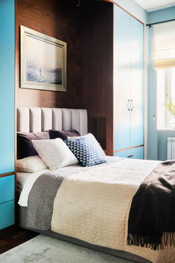
BEDROOM
If you have a similarly narrow (2.8 m) and relatively compact (13 sq. m) room designated as a bedroom, and—like the owners of this space—you need to maximize storage, placing wardrobes on either side of the bed is an excellent solution.
Originally, the room featured a corner wardrobe that was completely overfilled and still insufficient for the clients’ needs. We decided to move away from this layout altogether. With two pentagonal rooms already present in the apartment, introducing another angled structure would have added unnecessary complexity. Instead, we opted for a clean, linear layout.
For added convenience, we integrated niches into the sides of the wardrobes, incorporating switches, power outlets, and small surfaces for essentials like books, glasses, or charging a phone overnight. This configuration allowed us to increase the wardrobe length by nearly one meter compared to the original corner solution.
The only drawback was the asymmetry of the wall sections near the window, but this was effectively softened by using a single-sided curtain.

COLOR AND STYLE
The clients’ appreciation for walnut finishes was highlighted with soft, light tones on the walls and in the kitchen and bathroom tiles. Black accents were introduced throughout the interior to prevent the spaces from feeling flat or monotonous.
Contrasting elements—such as lighting fixtures, door and furniture handles, track lighting, picture frames, and appliance finishes—add a graphic quality and break up the uniform palette.
The bedroom was originally designed in soft blue tones, which the clients were fond of, so we chose to preserve this palette and extend it into the study. This approach helped create a cohesive visual language throughout the apartment.
A seamless flow between spaces is essential: when one room transitions naturally into another without abrupt contrasts, the entire apartment feels more spacious, harmonious, and balanced.
ОТЗЫВ ХОЗЯЕВ КВАРТИРЫ:
“
An excellent job by the entire team — a beautiful design and a complete set of documentation, including a full project specification.
The apartment design fully reflected our wishes, while also introducing unexpected solutions that enhanced the overall concept. Author supervision was extremely valuable during the renovation process and truly essential.
The contractors for built-in furniture and curtains delivered high-quality work, creating unique, custom pieces.
We are very happy with the work of Svetlana and her team. The apartment has a wonderful atmosphere that sets a truly приятный and comfortable mood.
— Natalia & Aleksader


