
SOKOL
Location
Moscow
Area
84.5 sq. m
Rooms
3
Height
3.20 m
 |  |  |  |
|---|---|---|---|
 |  |  |  |
 |  |  |  |
 |  |  |
A city apartment for a family couple who live permanently outside the city and occasionally visit for work and errands. They rarely entertain guests but wanted the ability to host their adult son, daughter‑in‑law, and grandchildren overnight when needed. The decision was made from the outset not to reconfigure the layout, keeping all rooms within their original walls. A key requirement was to provide additional sleeping space for the son's family or grandchildren when they stay over.
LAYOUT
The apartment has an unusual layout with a significant number of load‑bearing walls – which presented both challenges and opportunities. The living room and kitchen are pentagonal, irregularly shaped spaces. Careful planning was essential to ensure smooth traffic flow, thoughtful zoning, and a clear distinction between primary and secondary areas. We embraced the unique geometry, positioning the living room furniture to encourage conversation and socialising, while also allowing the owners to unwind with a film after a long day.


LIVING ROOM
The expression "looking for a fifth corner" usually means finding yourself in a dead end. We weren't actively searching for one – but in this project, it found us: a pentagonal living room in a Stalin‑era building.
Rectangles and squares are widely considered the most comfortable room shapes – ergonomic and easy to style. Unusual forms like semicircles, ellipses, pentagons, hexagons, and long, narrow spaces may look striking in developers' brochures, but in practice, they only add complexity to the interior design process.
In the living room, we zoned the space into a primary relaxation area and secondary zones for storage. We recommend using rugs, accent lighting, and a central axis of symmetry to bring order to irregularly shaped rooms. Here, the sofa and side tables create a symmetrical axis, around which we placed standalone armchairs. A pendant light defines the centre of the composition, while a rug anchors the furniture grouping. The TV zone and the chest‑of‑drawers area are separate components, divided by an invisible circulation path. Crucially, all furniture shares common design features, helping to unify the space.

KITCHEN
As for the kitchen, the pentagonal shape presented certain constraints and challenges. The owner has a sink by the window in her country house – a feature she loves – and wanted to recreate it in the city apartment.
We set out to fulfil this wish by placing the kitchen along the window wall. This proved less straightforward than it might seem, as it required relocating the gas riser. Fortunately, the apartment is on the top residential floor, meaning the gas riser does not extend further upward. Mosgaz (the city gas utility) has standard solutions for this, allowing the riser to be lowered beneath the countertop. We discussed all the details with a Mosgaz engineer, adapted their standard solution to our specific case, and successfully installed the kitchen along the window.
BEDROOM
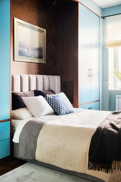
If, like the owners of this room, you have a narrow (2.8 m wide) and relatively compact (13 m²) bedroom and need maximum wardrobe space, the solution of placing wardrobes on either side of the bed is an excellent choice.
Initially, there was a corner wardrobe in this room, packed to capacity and still insufficient for the owners' needs. We immediately dismissed the idea of another corner wardrobe – with two pentagonal rooms already in the apartment, we didn't want to create another irregular element. Instead, we opted for a linear layout. For added convenience, we built niches into the wardrobe sides with switches, sockets, and space to place a book or glasses before sleep, or to charge a phone. This arrangement increased wardrobe capacity by nearly a metre compared to the corner option. The trade‑off was asymmetrical wall sections by the window, but we balanced this with a curtain on one side – effectively concealing the asymmetry.

COLOR AND STYLE
The owners' love for walnut was highlighted by soft, light wall tones and similarly warm tiles in the kitchen and bathroom. Black details throughout the interior – in lighting fixtures, door and cabinet handles, track lighting, picture frames, and appliances – prevent the space from feeling monotonous. These contrast elements break up the subtle tones, adding a graphic, structured quality to the design.
The bedroom originally featured blue hues, which the owners were fond of. We retained these tones in the bedroom and carried them through to the study, creating a cohesive look across the entire apartment. Consistency is key – when colours flow seamlessly from one room to another without abrupt changes, the apartment feels larger, more harmonious, and more spacious.
WHAT THE OWENERS SAY:
“
An excellent job by the entire team — a beautiful design and a complete set of documentation, including a full project specification.
The apartment design fully reflected our wishes, while also introducing unexpected solutions that enhanced the overall concept. Author supervision was extremely valuable during the renovation process and truly essential.
The contractors for built-in furniture and curtains delivered high-quality work, creating unique, custom pieces.
We are very happy with the work of Svetlana and her team. The apartment has a wonderful atmosphere that sets a truly приятный and comfortable mood.
— Natalia & Aleksader


